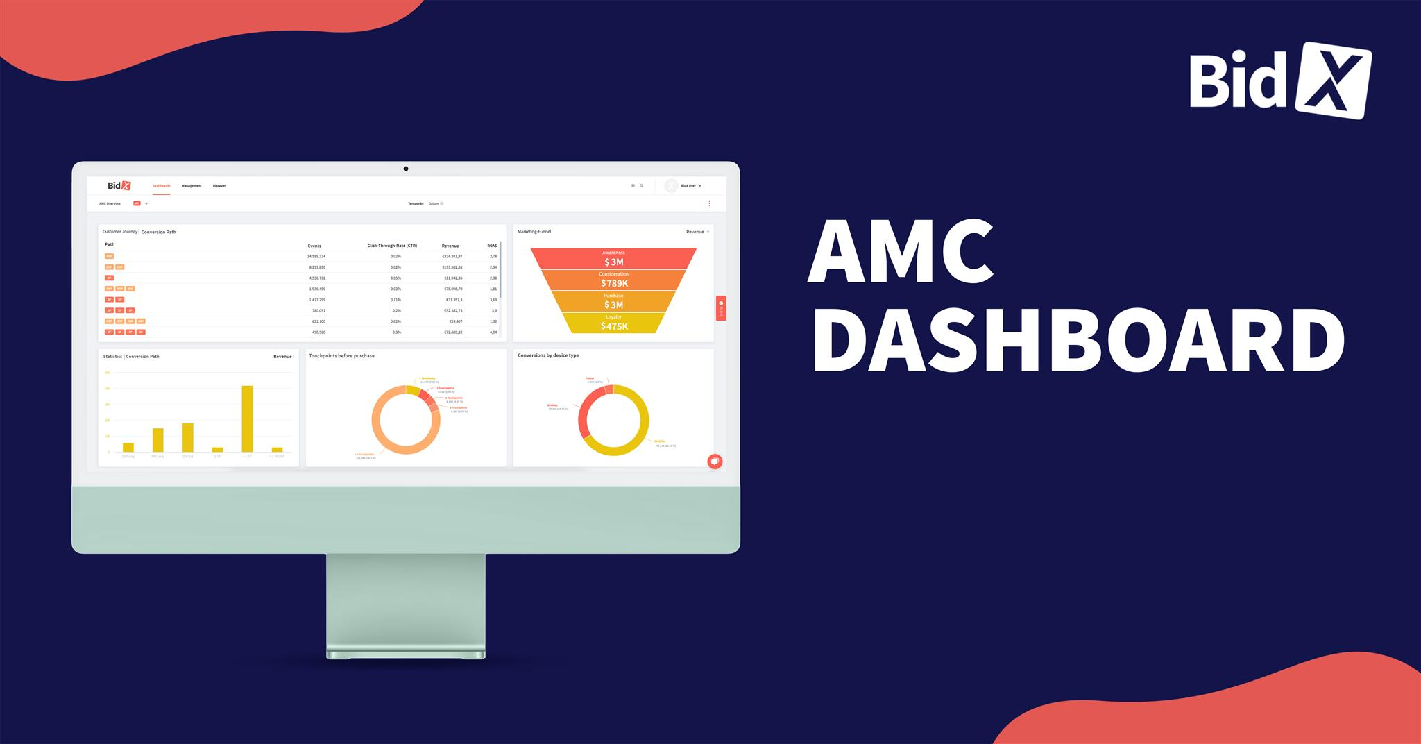
The wishes of our customers are the most important thing for us. For this reason, we have developed our new dashboard for you!
Every seller on Amazon has different needs and preferences when it comes to metrics and their presentation. Static charts and tables (e.g. in Seller Central or the Advertising Console) often can't cover these needs, because they are very inflexible and don't offer you the possibility to include your own requirements.
We have developed a new dashboard to optimally incorporate the individual needs of our customers. This offers you two decisive advantages: on the one hand, the flexible design of your dashboard based on your personal preferences and, on the other hand, the possibility to use multiple dashboard views in one account.
The possibilities offered by our new dashboard are unique and makes our tool the most powerful on the market for Amazon advertising.
In this article, we will show you the benefits of our flexible dashboard and illustrate them with use cases. To get a first visual insight into the features, it's best to watch this video.
Flexible appearance and individual adjustments
In your standard dashboard "Home" you will be shown the, according to our experience, most important key figures. This gives you the option to rely on proven metrics and charts and use our best practices - if that's what you want.
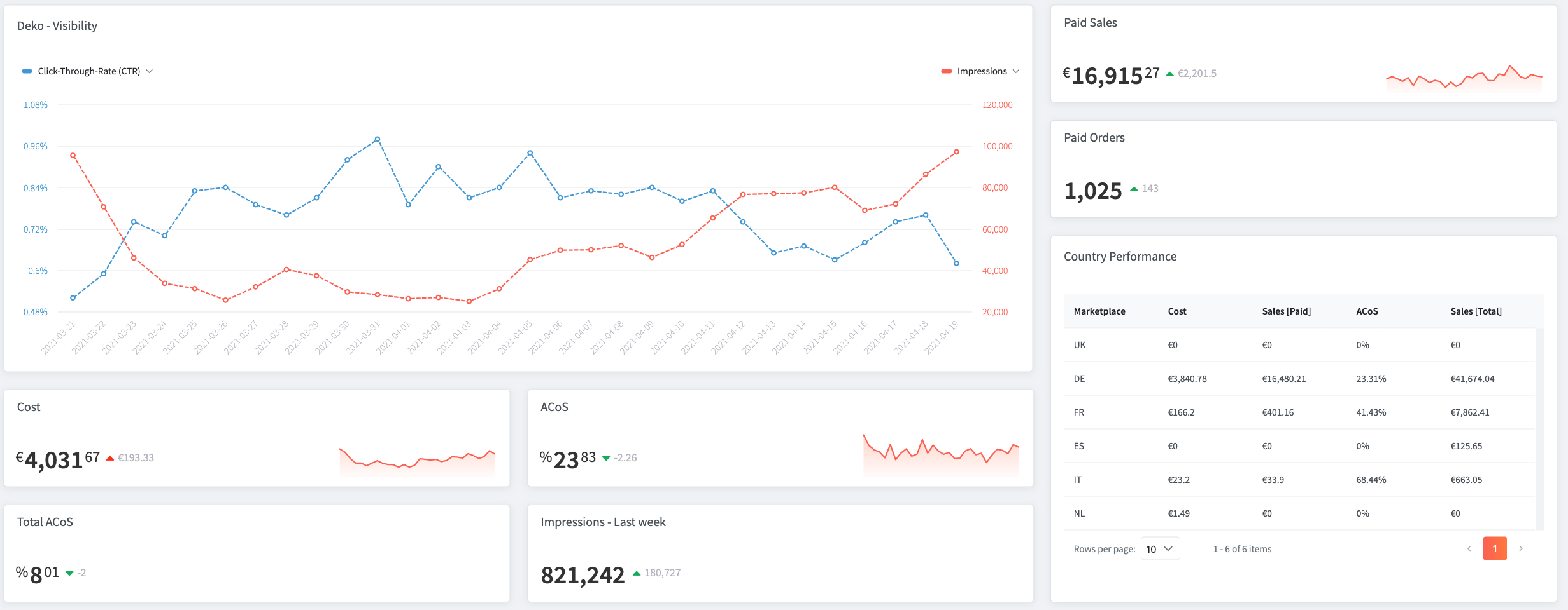
But you can also use our new dashboard to customize all charts and tables to your individual needs and adapt them at any time with just a few clicks. All key figures that are displayed in form of charts or tables in your dashboard can be individually adjusted - not only in terms of content but also graphically. This allows you to integrate your corporate design, for example, by adjusting the colors of the charts. In addition, you can also change the size of the charts and their position at any time.
This flexible layout has three major advantages:
1. No more wasted time
Because you can customize the data in your dashboard, you also have the ability to decide for yourself which data is most relevant and insightful to you. Metrics that are irrelevant or uninteresting to you can simply be removed from your dashboard.
With this pre-selection, you no longer waste your valuable time trying to find the data you are really interested in from different charts. You will receive all key figures at a glance and can evaluate and analyze them more quickly. You can also export the data as a PDF file - in the colors of your corporate identity.
Note: Diagrams and key figures that you have removed can of course be added again at any time.
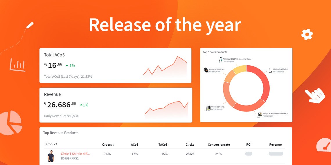
To give you a better idea of what your dashboard could look like, we have created two sample views for you.
Dashboard view 1
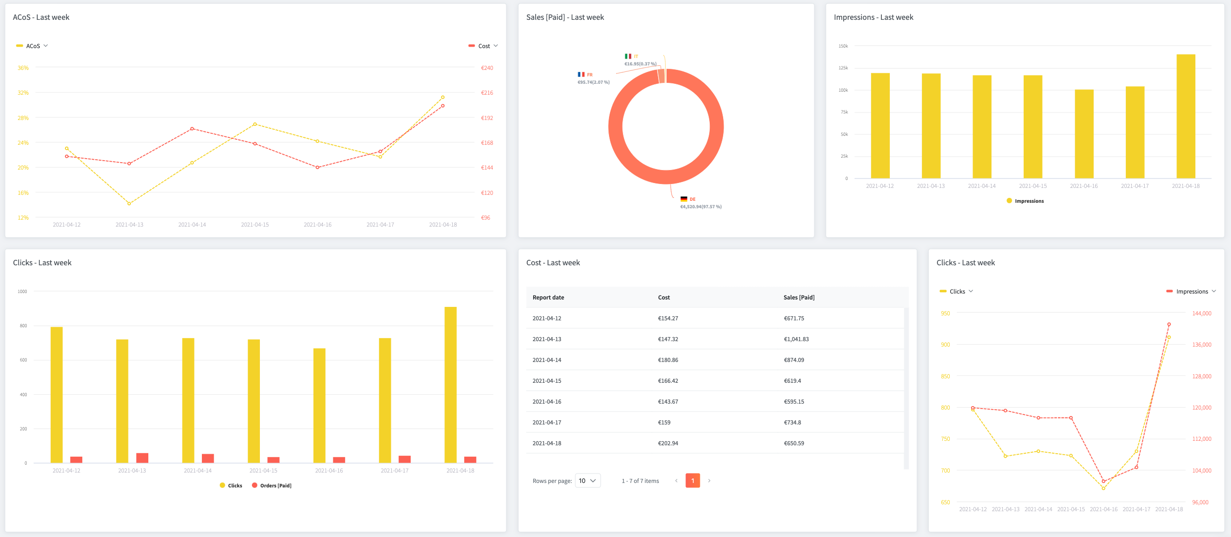
Dashboard view 2
2. Gain new insights and make better decisions
You now have the ability to compare all the metrics in your dashboard and use different chart types to display them. To draw even more conclusions from the data, you also have the option to use filters, for example to screen for specific marketplaces or ASINs. The advantage, compared to our old dashboard, is that all settings and filters you have set are persisted. In our old dashboard, filters were deleted when the page was reloaded and replaced with the default view. From now on, all charts and tables - with the set filters - will be maintained! This gives you the ability to gain insights from your advertising data easier and faster, which will help you to make better decisions for your success on Amazon in the future.
3. Clarity and structuring of the dashboard
Because you can easily drag and drop the individual elements, the new dashboard is extremely organized. For example, you can easily drag data that is particularly relevant to you on top or enlarge it.
You can also structure the dashboard by using text fields and dividing the screen into different sections with headings. There are no limits in implementing and structuring your dashboard.
Creation of multiple dashboards
With our update you have the possibility to create multiple dashboards as a single user. The view of the dashboards can be changed with just one click. This gives you the opportunity to create different dashboards for different purposes, making your data much clearer. Of course, you can create the different dashboards the way you want.
From our point of view, splitting the dashboards makes sense especially for products, countries or employees.
1. Products
Especially if you sell products from different categories, using multiple dashboards will make it much easier and faster to gather your data at a glance. Among other things, this helps you making decisions based on the performance of your products. It is also useful to use multiple dashboards if you sell products from different brands.
2. Countries
You can also create different dashboards for different countries to analyze the performance of your products on different marketplaces. This is especially useful to compare the success of your products on different marketplaces.
3. Employees
Dashboards can also be split by staff. For example, if your employees need to analyze different data or they specialize in different areas, you can create dashboards that are customized to the needs of your employees.
You also have the option to create a dashboard for your DSP data, giving you the best possible overview of your DSP campaigns.
The new dashboard gives you unlimited possibilities to display your metrics exactly the way you want. The biggest advantages here are the significant time savings, the clarity and the creation of multiple dashboards for different purposes.
Special features for agencies
Our new dashboard also offers significant advantages for agencies. You can now manage all your customer accounts in one main account.
So you have the possibility to create an individual dashboard for each customer and additionally create an overview with the data of all customers you manage.
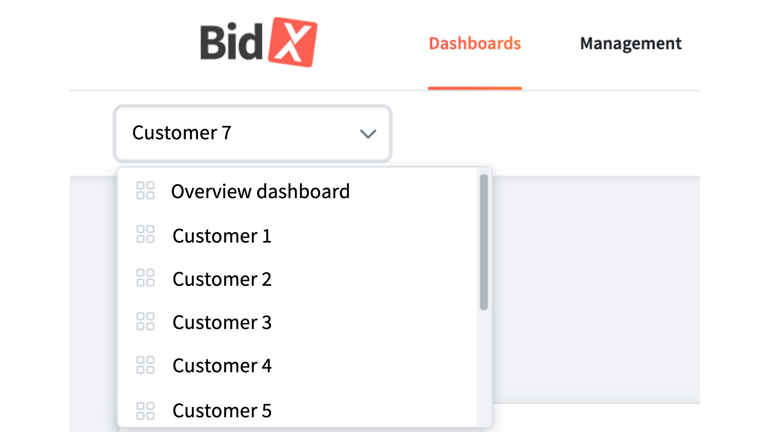
You can also customize the individual dashboards of your customers according to their needs. This way, you can include all the data relevant to a particular customer in their dashboard and capture it at a glance.
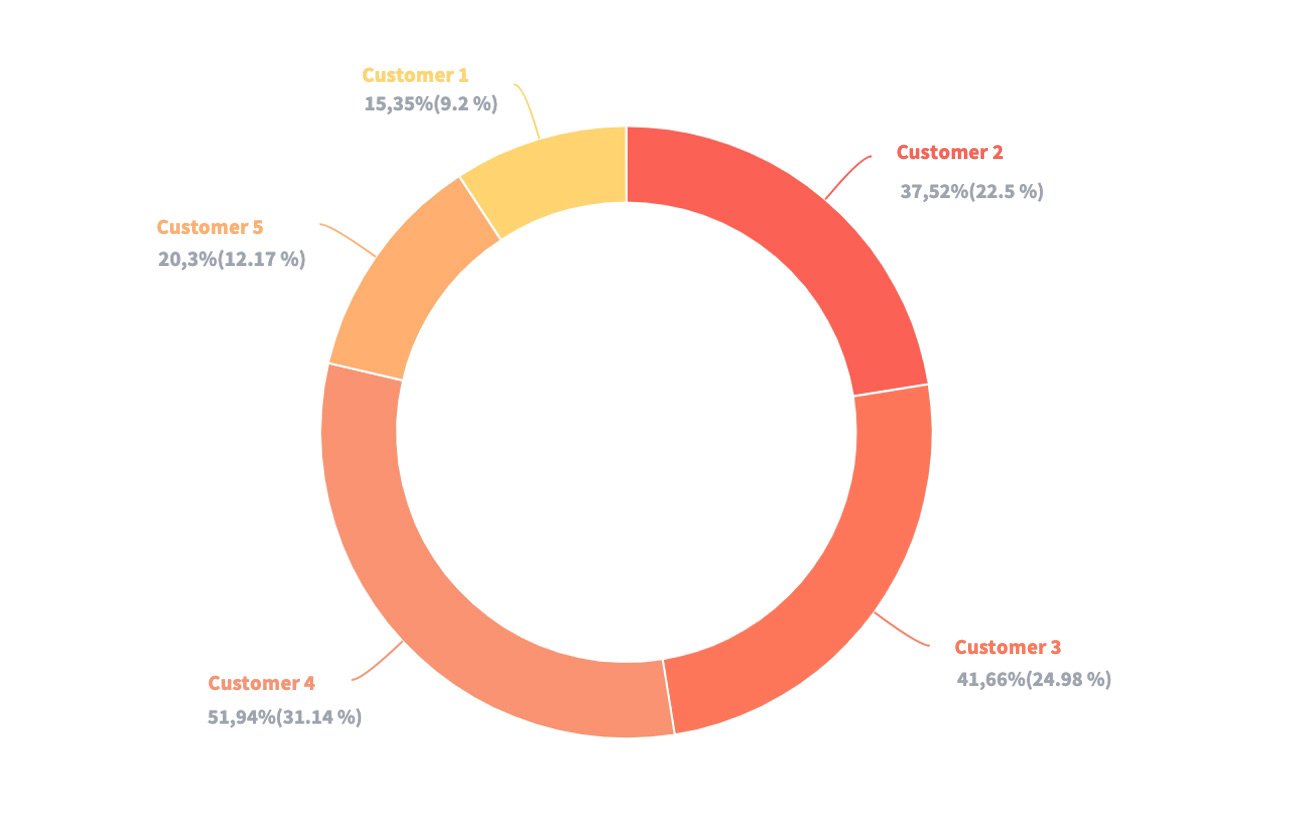
You can also create charts comparing data from individual customers. You can select as many customers as you want to be displayed in one chart. These charts can be included on your overview page to help you make faster and better decisions for individual customers.
If you want to learn more about the possibilities of our new dashboard, feel free to contact our support by phone or email at hello@bidx.io or just try it out!